

bannikin
Industry:
Travel and Tourism
What We Did:
Brand Development, Visual Identity, Communication and Correspondence Collaterals
We re-buillt the foundation for a refreshed brand that would help Bannikin navigate their transition while establishing a strong platform for future growth and market leadership in tourism development consulting.
Project Overview
During a pivotal transition period, Bannikin engaged in a comprehensive brand refresh project. The project aimed to realign their brand identity with their evolved service offerings and new organizational direction, while preserving the value of their established name. With an end-of-year deadline, the initiative was designed to support the company through significant structural changes, including ownership transition and service portfolio evolution.
-
Bannikin is a proudly Canadian and purposeful company operating within and beyond travel and tourism. The firm specializes in delivering tourism development and PR services to a breadth and diversity of client partners. Originally focused on adventure travel and tourism trade development, the company has evolved significantly over the past decade. Their current service portfolio includes:
Research, strategy, and development: insight generation, stakeholder engagement, destination stewardship, strategic planning, monitoring and evaluation, and capacity building
Strategic communications: media relations, marketing and communications, brand and content development.
Speaking and facilitation: industry events, panels, thematic workshops, strategy sessions.
The company distinguishes itself through high-quality deliverables, meticulous project management, and deep client-partner engagement.
-
Several factors necessitated the brand refresh:
Service Evolution: The company had shifted from primarily offering trade development and PR services to focusing as much on project-based strategic consulting work with destinations and destination organizations.
Ownership Transition: The company was undergoing a change in ownership, with four of the management team successfully aquiring the company in June 2024 from one of the original co-founders.
Market Positioning: The existing brand reflected their historical focus on adventure travel operators, while their services had expanded well beyond this niche into areas such as tourism development work with rural, remote, and emerging destination, and innovation projects.
Internal Alignment: New staff and soon-to-be owners struggled to connect with the existing brand messaging, including the tagline "You create incredible travel experiences. We elevate them." There was a need to align new company values and practice with its messages to the world.
-
The brand refresh needed to:
Maintain the Bannikin name while evolving its association with the language of "Travel & Tourism"
Update other brand elements, including logo and tagline
Reflect their expansion into destination development and other services
Position them as an innovation partner focused on positive tourism impact
Appeal to both current and prospective clients across expanded service areas
Create pride and ownership among new team members
Support their vision through 2030 and beyond
The refreshed brand needed to convey Bannikin as both creative and professional - a company that thinks outside the box while maintaining high standards of delivery. They wanted to be perceived as approachable experts who bring unique methodologies and deep expertise to tourism development projects.
-
The new brand needed to reflect their fundamental values:
Honesty
Integrity
Curiosity
Care
Their desired market position was as "Your partner and ally in maximizing the positive impacts of tourism," with an emphasis on creating positive and lasting change through tourism development.


The Symbolism
Bannikin is a word that Newfoundland locals use for a "small tin cup", and this is derived from the British word, pannikin, which means "small metal pan or drinking cup". Small tin-coated steel cups made from empty soup cans are an historical example of "upcycling" or "creative reuse"; that is, an innovative way of giving used materials a second life by transforming their structure and purpose.
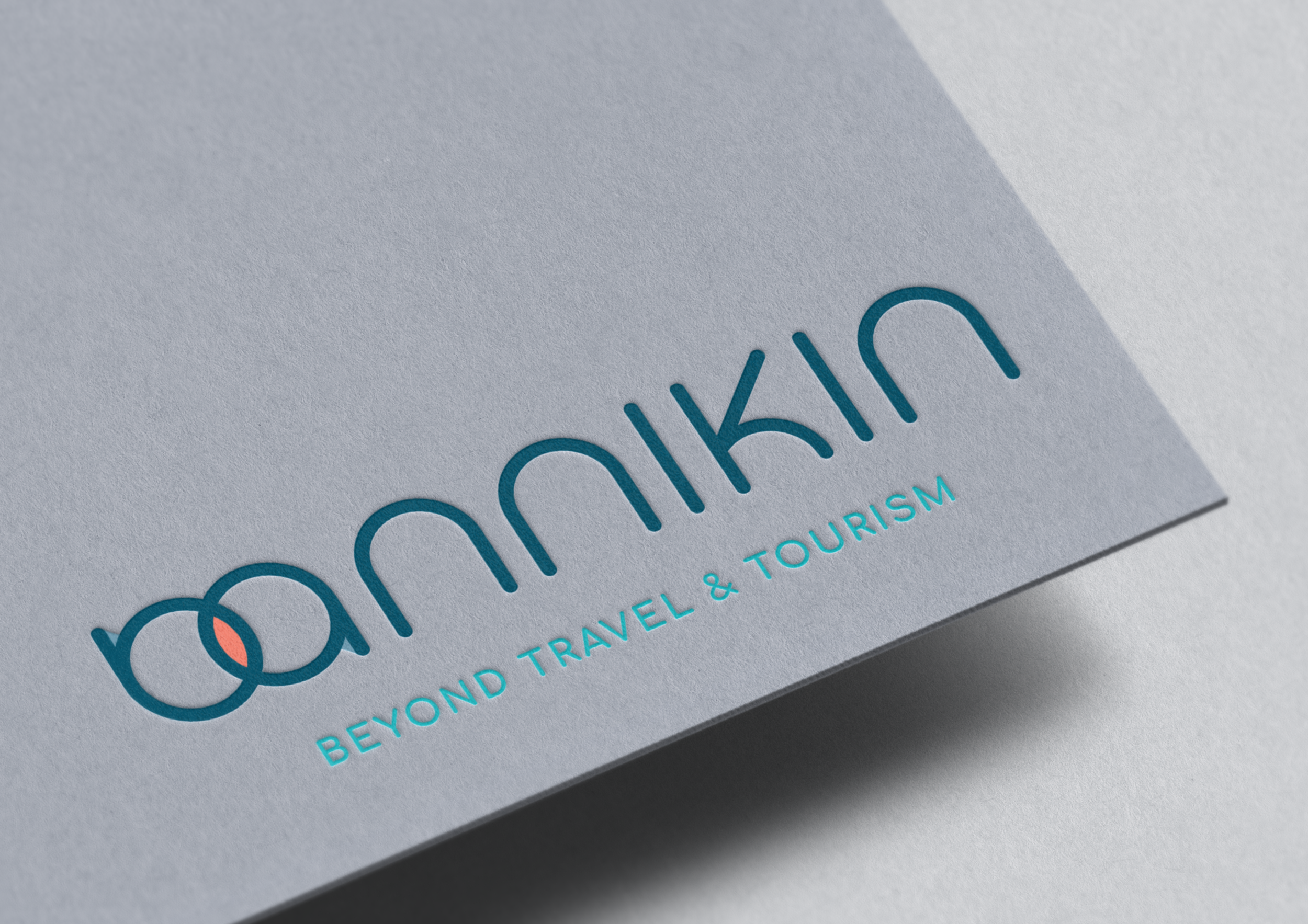
Bannikins, which are now often made using enamel-coated steel, are uniquely connected to travel and tourism, and more specifically to shared experiences in the great outdoors, such as sitting around a camp fire. The overlapping circles in the double-bannikin logo mark depict a Venn Diagram that represents the collaborative approach the company takes while working with its client-partners. Both coming together to co-create value in the world.
“When you are sipping from a Bannikin, you are usually in good company.”


Success!

Feat. Work


